Creating Your First Hover Effect
Your first hover effect is only a few clicks away. This step-by-step guide walks you through the whole process, from opening the plugin to seeing your first hover effect go live on your site. No coding is needed, and the whole thing takes about 5 minutes.
Step 1: Open the Plugin
In your WordPress admin dashboard, click on Image Hover in the left sidebar. This opens the main plugin panel where all your saved styles are listed.
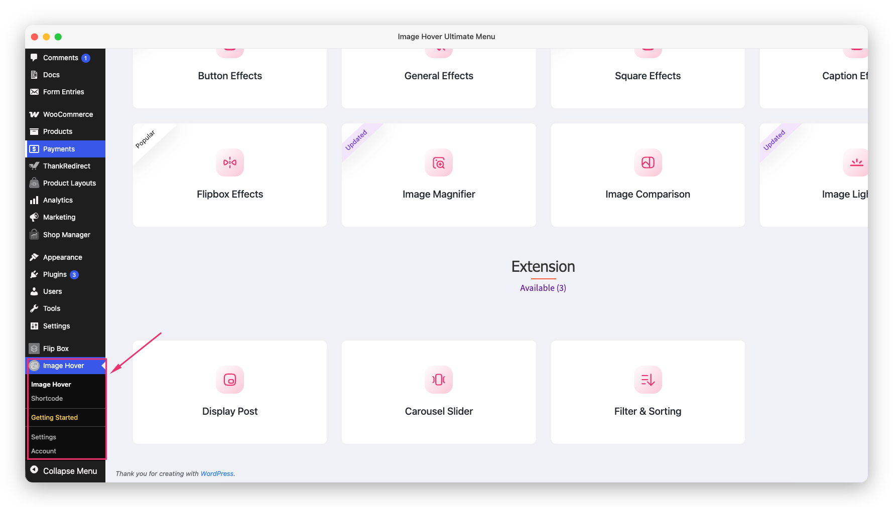
Step 2: Choose an Effect Type
Before creating a new style, decide which type of hover effect you want. This is the most important decision, it determines the overall behavior and animation style. Available types:
- General: Classic image hover with color overlay and text
- Caption: Text slides in from different directions
- Flipbox: Image flips to reveal content on the back
- Lightbox: Click to open a full-screen popup
- Button: Icon buttons appear on hover
- Square: Square-shaped hover containers
- Magnifier: Zoom in on the image
- Comparison: Drag to compare two images
- And more…
For your first hover effect, try General, it’s the most versatile and easiest to understand.
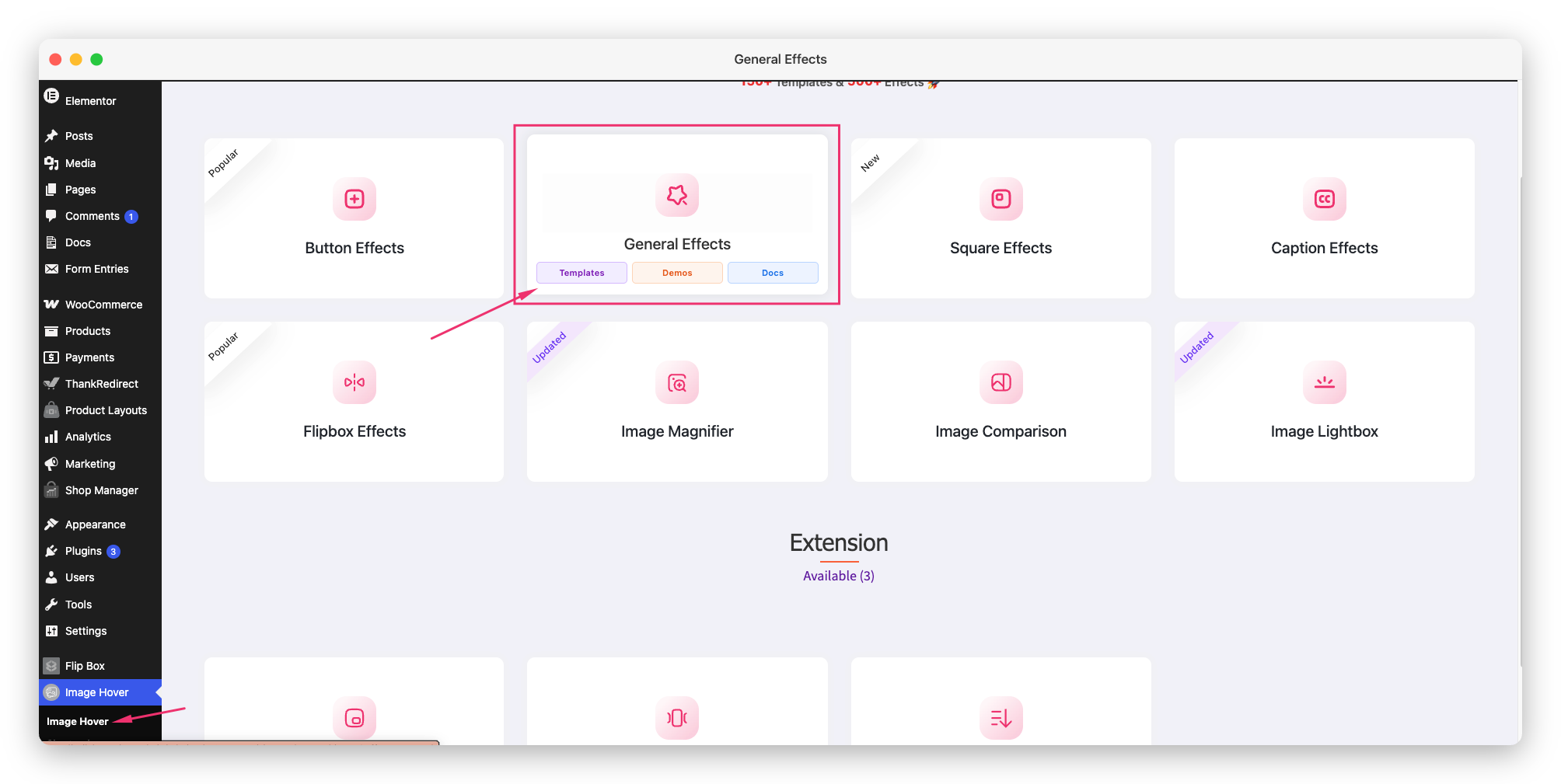
Step 3: Pick a Style
Each effect type has multiple style and layout variations. For General effects, there are 33 different layouts and 99 different styles to choose from. Each layout determines how the text, overlay, and animation behave on hover.
Hover through the layouts to preview each one. Choose the one that fits your vision.
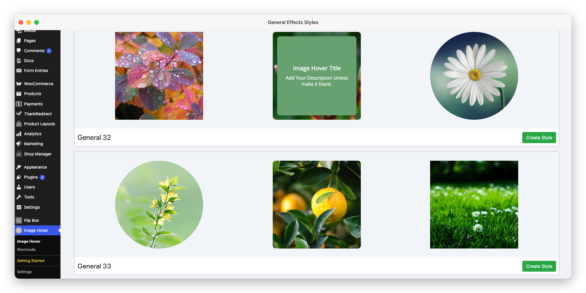
Step 4: Create a New Style
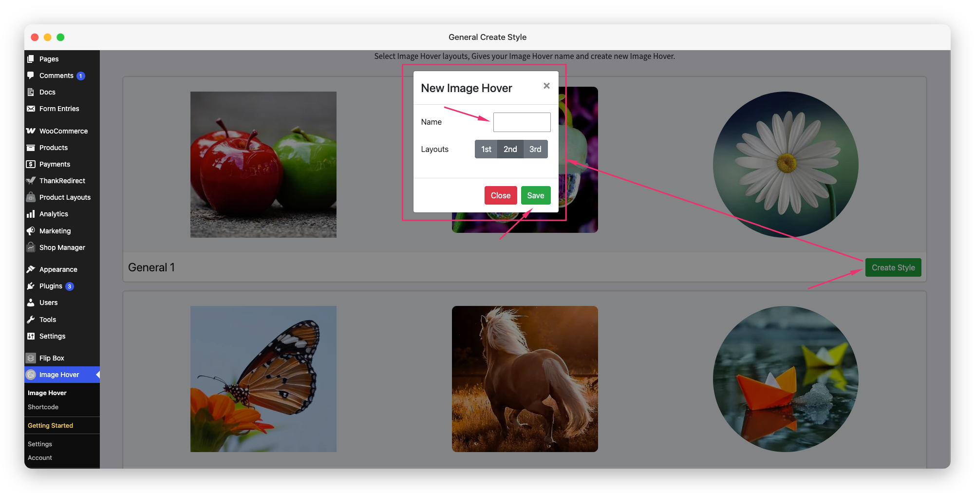
Once you know your effect type, click the Create Style button on the style card. Clicking this opens a modal to add a style name. Enter a name for your style. This is just for your own reference, visitors won’t see it. Something like “Homepage Gallery” or “Portfolio Effects” works fine. Click the Save button in the modal. You will then be redirected to the Layout Editor page.
Step 5: Add Your Images
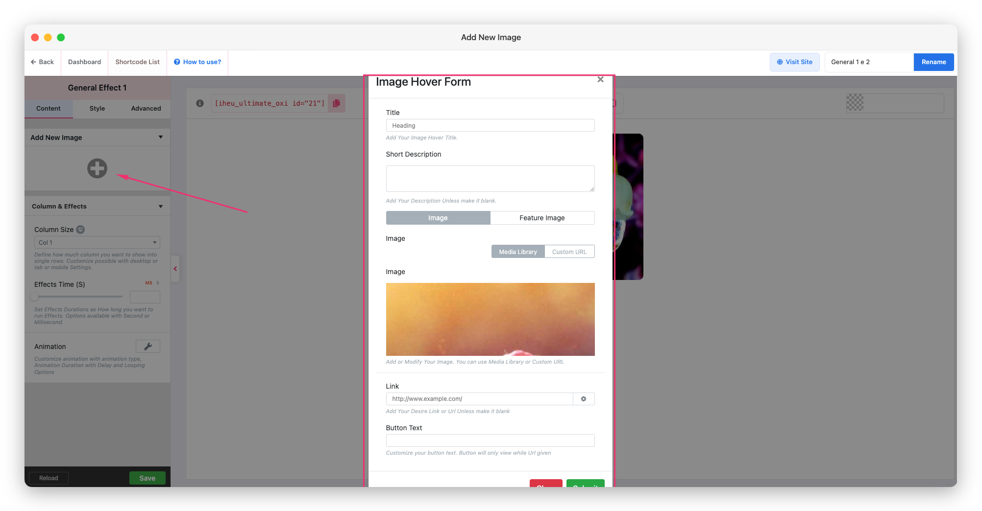
Click Add New Image from the left sidebar. A modal will open where you can add your image details.
For each image, you can set the following:
- Image: Upload an image or select one from the Media Library
- Title: The heading text displayed on hover
- Description: Supporting text displayed on hover
- Link URL: The destination URL when the image is clicked
Repeat this to add as many images as you need.
Step 6: Customize the Design
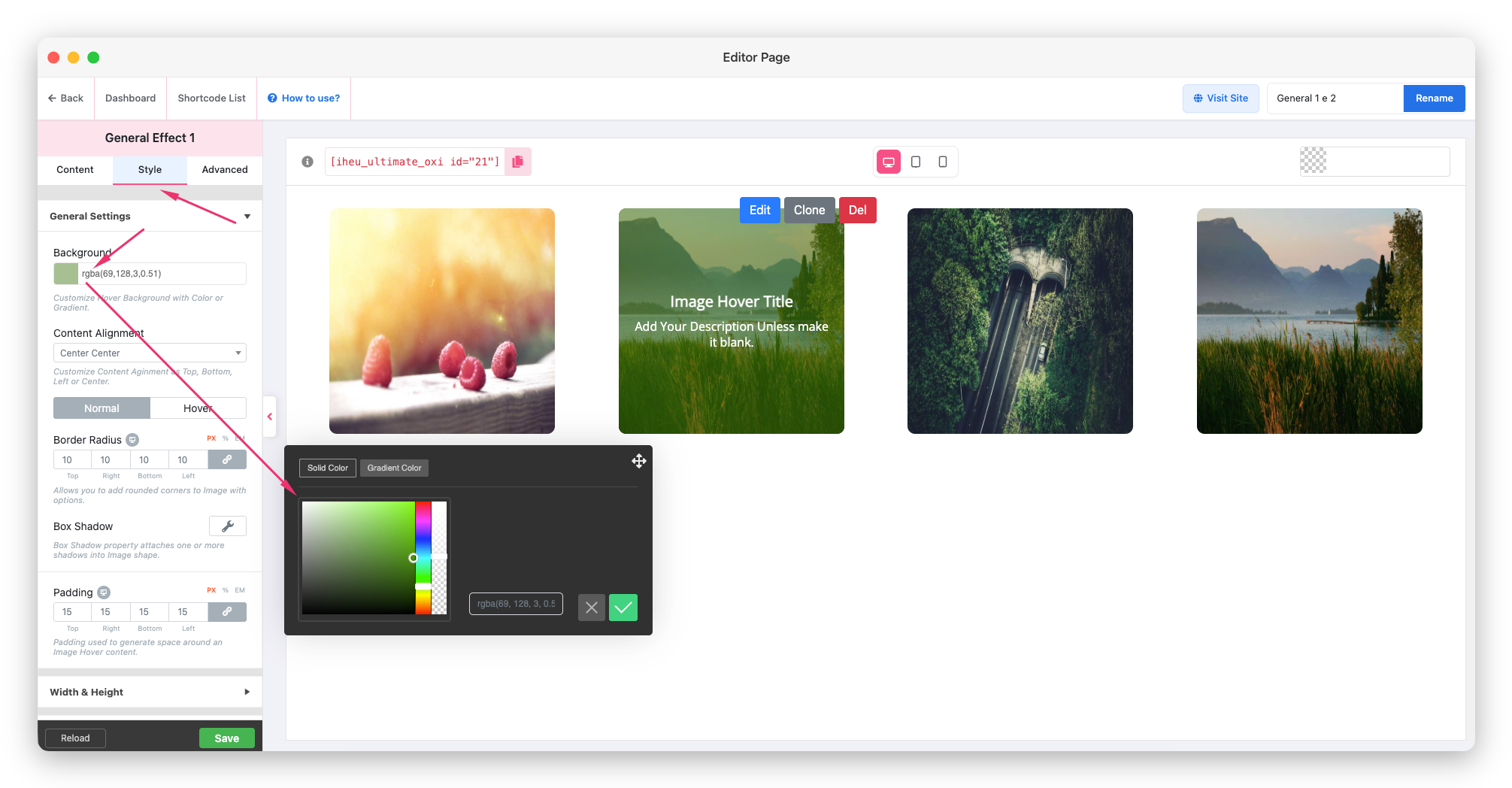
Use the settings panels to customize the look:
- Colors: Set the overlay color, text color, button color
- Typography: Choose font, size, and weight for title and description
- Animation: Select entrance animation (fade, slide, zoom, etc.)
- Layout: Set image size, columns, border radius, and spacing
Don’t worry about getting everything perfect right now. You can always come back and edit.
Step 7: Save Your Style and Copy the Shortcode
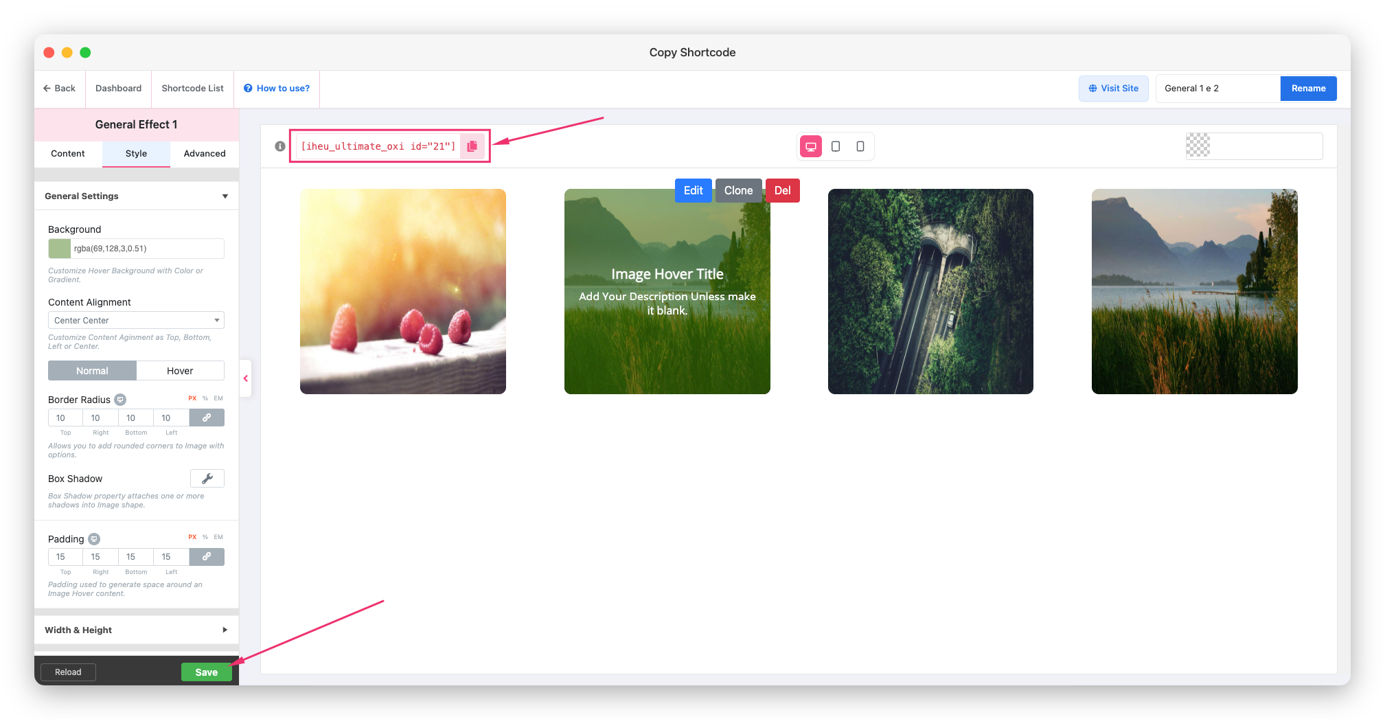
Click the Save button to save your style. The plugin will generate a unique ID for this style.
After saving, you’ll see your shortcode displayed. It looks like this:
[iheu_ultimate_oxi id="1"]The number in the shortcode is your style’s unique ID. Copy this shortcode.
Step 8: Embed It on Your Page
Now go to the WordPress page or post where you want to display the hover effect.
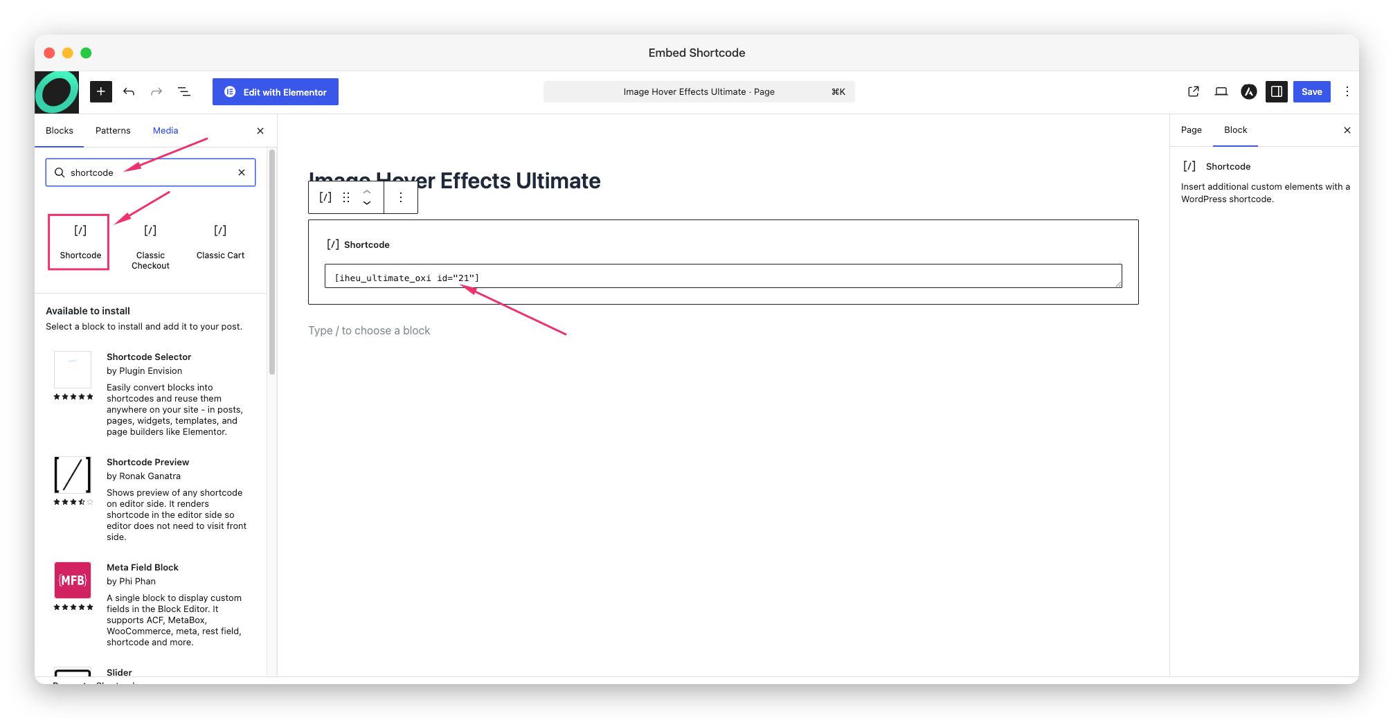
- In Gutenberg (Block Editor): Add a Shortcode block (part of the WordPress block editor) and paste the shortcode.
- In Classic Editor: Switch to Text mode and paste the shortcode.
- In Elementor: Add a Shortcode widget and paste the shortcode.
Save or publish the page, then visit it in your browser to see your first hover effect in action!
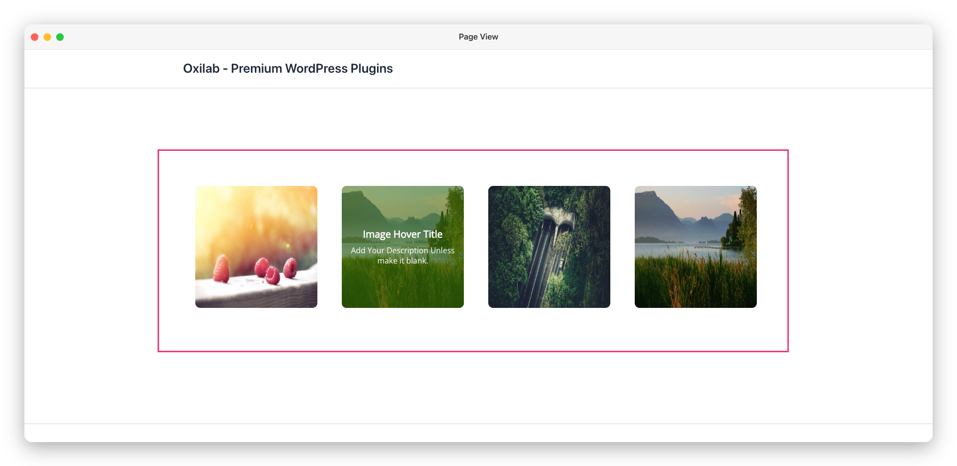
Prefer a Native Widget? Embed Without a Shortcode
The shortcode works on any page, but you don’t have to use it. Image Hover Effects Ultimate also comes with its own native widgets and blocks. That means you can drop your first hover effect straight into your favourite editor and pick your saved style from a dropdown, with no copy-pasting at all.
Pick the guide that matches the builder you use:
- WordPress Widget (Gutenberg): Add a hover effect from the block editor’s widget. Using it as a WordPress widget →
- Native Gutenberg Block: Search for the Image Hover block right inside the editor. Using the native Gutenberg block →
- Elementor: Drag the dedicated widget onto any Elementor layout. Using it with Elementor →
- WPBakery / Visual Composer: Add the element from the WPBakery builder. Using it with WPBakery Visual Composer →
Whichever method you choose, your first hover effect looks exactly the same on the front end, so go with the one that feels most comfortable.
Pro Tips for Your First Hover Effect
- 🖼️ Use images of the same dimensions for a consistent, clean look.
- 🎨 Keep your overlay color consistent with your site’s brand colors.
- 📱 Always preview on mobile after publishing, tap once to see the hover, tap again to follow the link.
- ✏️ Your first hover effect doesn’t have to be perfect on day one, you can edit the style anytime without changing the shortcode.
What’s Next?
Now that you’ve built your first hover effect, explore the different Effect Types to find the perfect look for your site. Each type has its own unique capabilities and use cases.